
JelliPay
Send. Spend. Simplify.
A modern payment platform concept designed to bridge the gap between peer-to-peer ease and lightweight business tools for freelancers, small businesses, and everyday users.
Role: Product Design, Branding, Marketing Strategy
Timeline: Concept Project | 2-4 weeks
Tools: Figma, Illustrator, Canva
Type: UX/UI, Brand Identity, Growth Strategy
JelliPay was created as a fintech concept that combines the simplicity of peer-to-peer payment apps with the practical tools growing users actually need. The goal was to create a platform that feels easy, polished, and useful without overwhelming the user.
Case Study Breakdown
A product, brand, and growth strategy designed from concept to launch.
DISCOVER
What problem are we actually solving?
Fragmented financial tools create confusion, inefficiency, and lack of clarity.
Freelancers, creators, and small business owners are forced to manage their finances across multiple platforms—sending payments through one app, tracking income in another, and handling expenses or taxes separately. This fragmented system creates unnecessary complexity, making it difficult for users to fully understand their financial situation.
Instead of feeling in control, users are left piecing together information from different tools, often relying on manual tracking or guesswork. Over time, this leads to inefficiencies, missed insights, and a lack of confidence in their financial decisions.
JelliPay addresses this gap by rethinking how financial management should work—bringing everything into one unified, intuitive system that prioritizes clarity, ease, and control.
Key Pain Points Identified
Fragmented Tools
Managing money across multiple apps makes it hard to stay organized.
Manual Tracking
Users rely on spreadsheets or memory to track income and expenses.
Whose pain points are these? -And what are they?
Freelancers, content creators, and small business owners managing multiple income streams.
Focused on freelancers and creators managing independent income.
These pain points are based on common financial workflows experienced by freelancers, creators, and small business owners who rely on multiple tools to manage income, expenses, and payments.
Lack of Financial Visibility
There’s no clear, real-time view of where money is coming from or going.
Overwhelming Systems
Existing tools are either too complex or not built for everyday users.
Disconnected Workflows
Payments, tracking, and insights don’t exist in one seamless system.
Target User: Freelancers & Creators
How are users currently managing money?
A multi-platform workflow that requires constant switching and manual effort.
Users manage their finances through a mix of platforms such as Venmo, PayPal, QuickBooks, and spreadsheets. Each tool serves a specific purpose, but none provide a complete, unified view of their financial activity.
As a result, users are forced to switch between apps to send payments, track income, and manage expenses. This fragmented workflow increases manual effort, creates inefficiencies, and makes it difficult to maintain an accurate understanding of their finances.
Current Multi-Platform Workflow
Venmo:
Send / Receive

PayPal:
Send / Receive (Business)

QuickBooks:
Track / Accounting
Spreadsheets:
Manual Tracking
Where do existing platforms fall short?
Current solutions prioritize either simplicity or functionality
Existing financial tools tend to fall into two extremes—either overly simplified platforms that lack meaningful financial insight, or complex systems that overwhelm users with features and technical language.
Platforms like Venmo and PayPal make sending money easy but offer limited visibility into overall financial activity. On the other hand, tools like QuickBooks provide robust tracking and reporting but require a level of time, knowledge, and effort that many users don’t have.
This gap leaves users without a solution that balances ease of use with functionality—forcing them to choose between convenience and clarity instead of having both in one system.
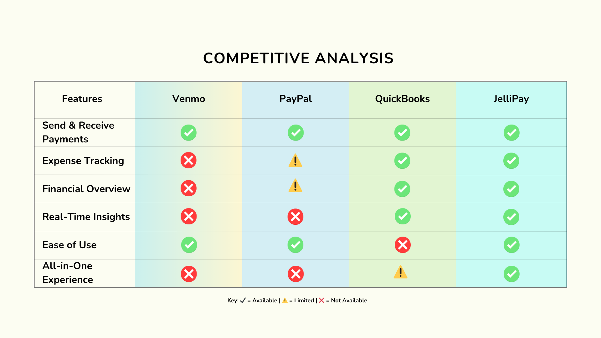
Competitive Analysis Snapshot
DEFINE
Who is JelliPay for?
Built for modern earners managing independent and flexible income.
JelliPay is designed for freelancers, content creators, and small business owners who manage their own income across multiple sources. These users often operate without a traditional financial system, relying on a mix of tools to handle payments, tracking, and expenses.
They need a solution that simplifies financial management without sacrificing visibility or control—something that fits seamlessly into their daily workflow rather than adding more complexity. JelliPay focuses on supporting these modern earners by providing a centralized, intuitive experience tailored to how they actually manage money.

Meet Alex
Alex, 27 – Freelance Designer
Alex is a freelance designer managing multiple clients and income streams. He receives payments through platforms like Venmo and PayPal, tracks income in spreadsheets, and uses QuickBooks occasionally for expenses and taxes.
While these tools get the job done, his workflow feels scattered and time-consuming. He often switches between apps to understand his finances, making it difficult to get a clear, real-time picture of his earnings. Alex wants a simpler way to manage everything in one place—without sacrificing control or insight.
Goals:
Track income and expenses in one place
Understand financial health at a glance
Simplify money management without losing control
Behaviors:
Uses Venmo and PayPal for payments
Tracks income manually through spreadsheets
Occasionally uses QuickBooks for expense tracking
Frustrations:
Has to switch between multiple apps to manage finances
Doesn’t have a clear, real-time view of income and expenses
Financial tools feel either too basic or too complicated
What do users actually need from a payment platform?
Clarity, simplicity, and control, without added complexity.
Users need more than just a way to send and receive money—they need a clear understanding of their financial activity. This includes being able to see all income and expenses in one place, track transactions effortlessly, and make informed decisions without confusion.
Beyond functionality, users are looking for a system that feels intuitive and manageable. They want tools that simplify their workflow, reduce manual effort, and provide meaningful insights without overwhelming them. A successful platform balances ease of use with enough depth to support real financial needs.
Key User Needs
Clarity
Simplicity

Control
Visibility
Ease of Use
Aligning product direction with real user behavior
Designing around real workflows instead of idealized systems.
Current User Behavior Flow:
JelliPay is built around how users actually manage their money day-to-day—sending payments, receiving income, and tracking expenses across different tools. Instead of forcing users into rigid financial systems, the product adapts to their existing behaviors and simplifies them.
By focusing on real workflows, JelliPay reduces friction and removes unnecessary steps. The goal is to create a system that feels natural to use, allowing users to manage their finances without having to rethink or restructure how they already operate.
Defining the middle ground: simple + powerful
Venmo
PayPal
JelliPay
QuickBooks
Balancing ease of use with meaningful functionality.
JelliPay bridges the gap between overly simple tools and overly complex financial systems. Many platforms force users to choose between convenience and capability—either offering a streamlined experience with limited insight or a powerful system that requires time and effort to navigate.
JelliPay is designed to deliver both. It provides a simple, intuitive interface that supports everyday use while still offering the functionality users need to track, understand, and manage their finances effectively. The goal is to create a system that feels effortless without sacrificing depth.
DEVELOP
How should the product experience work?

Early Dashboard Wireframe
A fast, clear, and effortless experience built around financial clarity.
The JelliPay experience is designed to feel fast, clear, and effortless from the moment users open the app. Every interaction is focused on reducing friction and helping users understand their financial position without unnecessary steps.
At any point, users should be able to quickly see their balance, track transactions, and understand where their money is going. The interface prioritizes clarity and simplicity, ensuring that users can take action with confidence rather than confusion.
The goal is to create an experience that feels intuitive and immediate—where users don’t have to think about how to use the product, only what they want to do.
Designing flows that reduce friction
Core User Flows
Flow 1:
Home
Home
→
Send / Request
Flow 2:
→
View Transactions
→
→
Confirm
Categorize
→
→
Done
Done
Simplifying key actions to make financial tasks faster and easier.
JelliPay focuses on simplifying core user flows to reduce unnecessary steps and cognitive load. Actions like sending payments, receiving income, and tracking expenses are designed to feel quick, seamless, and intuitive.
Instead of navigating through multiple screens or complex processes, users can complete tasks in just a few steps. Each flow is intentionally streamlined to support speed and clarity, allowing users to manage their finances confidently without friction or confusion.
What features matter most?
Prioritizing features that support clarity, control, and ease of use.
JelliPay focuses on features that directly improve how users understand and manage their finances. Instead of overloading the product with unnecessary functionality, the focus is on delivering a core set of tools that feel essential, intuitive, and easy to use.
Key features include a unified dashboard, simplified transaction tracking, real-time financial insights, and lightweight invoicing. Each feature is designed to reduce manual effort while giving users better visibility and control over their money.
The goal is to prioritize what matters most—ensuring every feature adds value without increasing complexity.
Placeholder:
[Image: Feature Prioritization Chart]
What to draw (simple):
👉 Option 1 (best):
2x2 grid:
High Impact / Low Effort → highlight
High Impact / High Effort
Low Impact / Low Effort
Low Impact / High Effort
Place features like:
Dashboard (top priority)
Tracking
Insights
Invoicing
👉 Option 2 (easier):
Just list features in boxes with a “Priority” label
Building a system that feels intuitive and modern
A clean, accessible interface designed for ease and clarity.
JelliPay is designed with a focus on clarity, simplicity, and usability. The interface uses a clean layout, clear visual hierarchy, and thoughtful spacing to ensure users can quickly understand and navigate the system.
A mobile-first approach ensures the experience feels seamless across devices, while accessibility and readability remain a priority. Every design decision supports ease of use—helping users find what they need, take action quickly, and manage their finances without friction.
The goal is to create a system that feels modern, approachable, and easy to use from the first interaction.
Placeholder:
[Sketch: Layout Structure OR UI Blocks]
What to draw (simple):
👉 Basic screen layout:
Top: Balance / Overview
Middle: Transactions
Bottom: Actions (Send / Request)
OR
👉 Wireframe blocks:
Header
Cards
List
Buttons
Creating a visual identity that supports trust and ease
Placeholder:
[Link: Full Brand Style Guide ↗]
[Image: Color + Typography Snapshot]
An approachable design system that makes financial tools feel less intimidating.
JelliPay’s visual identity is designed to make financial management feel approachable, clear, and trustworthy. Instead of using overly corporate or complex design patterns, the brand leans into soft, fluid visuals and a clean interface to reduce intimidation.
Color, typography, and layout work together to create a sense of clarity and ease, helping users feel more confident as they interact with the platform. The visual system supports usability first—ensuring that every element contributes to a more intuitive and comfortable experience.
DELIVER
How does JelliPay come to life?
A digital-first product brought to life through product, brand, and experience.
JelliPay comes to life as a digital-first platform designed to seamlessly integrate product, brand, and user experience. The launch focuses on delivering a cohesive system where users can immediately understand, interact with, and trust the product.
From the first interaction, users are introduced to a clear and intuitive interface supported by a strong visual identity. The experience is designed to feel polished, accessible, and ready for real-world use—bridging the gap between concept and a fully realized product.
Placeholder:
[Image: Product Mockup OR App Screen Sketch]
Launch strategy and market positioning
A social-first approach targeting modern freelancers and creators.
JelliPay’s launch strategy is centered around reaching freelancers, creators, and small business owners through a social-first approach. The focus is on meeting users where they already spend their time—leveraging platforms like Instagram and TikTok to introduce the product in a relatable and engaging way.
Messaging is built around simplicity, clarity, and control, highlighting how JelliPay reduces financial stress and streamlines everyday workflows. By positioning the product as both approachable and powerful, the launch aims to build early trust, drive adoption, and establish a strong presence within the creator economy.
Placeholder:
[Link: Launch Strategy Deck ↗]
Measuring success through growth and engagement
Tracking performance through acquisition, retention, and user behavior.
JelliPay’s success is measured through key growth and engagement metrics that reflect both user adoption and long-term value. This includes tracking user acquisition, retention rates, engagement levels, and feature usage to understand how users interact with the product over time.
By focusing on these metrics, JelliPay can identify what’s working, where users drop off, and how the experience can be improved. This data-driven approach ensures the product continues to evolve based on real user behavior, supporting sustainable growth and stronger user retention.
Placeholder:
[Link: Growth & KPI Plan ↗]
[Sketch: KPI Dashboard]
What’s next for JelliPay?
Evolving the product to support deeper insights and long-term growth.
Future iterations of JelliPay focus on expanding core features, improving financial insights, and scaling the platform to better support users over time. As user needs evolve, the product will continue to refine its experience by introducing more advanced tracking, personalized insights, and additional tools that enhance financial clarity.
The goal is to build a system that grows with its users—adapting to more complex financial needs while maintaining the simplicity and ease that define the core experience.
Placeholder:
[Image: Roadmap OR Future Features List]
What to draw (simple):
👉 3 columns or steps:
Now → Core features (Dashboard, Tracking)
Next → Insights, Automation
Future → Advanced tools, Scaling